
A Cosmetic Change Made To Our Registration Page
@thebigk
•
Oct 19, 2024
Oct 19, 2024
832
I was going through the logs and found out that we're missing out on ~70 registrations per day because members did not enter correct email address during registration form. As a result, they never receive the account confirmation mail.
We already display a little notice that asks users to enter correct email ID in the email field. I made the notice text a little larger -
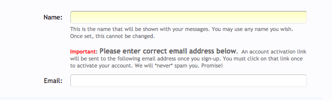
Do you think this should suffice? Is there anything else we should do, for example - display a big notice at the top of registration form asking users to enter correct email and then activate their accounts by clicking on account activation links?
We already display a little notice that asks users to enter correct email ID in the email field. I made the notice text a little larger -
Do you think this should suffice? Is there anything else we should do, for example - display a big notice at the top of registration form asking users to enter correct email and then activate their accounts by clicking on account activation links?