Switching Over To Wider Layout - Feedback Please

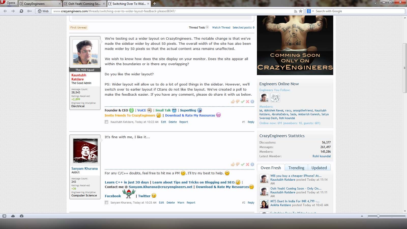
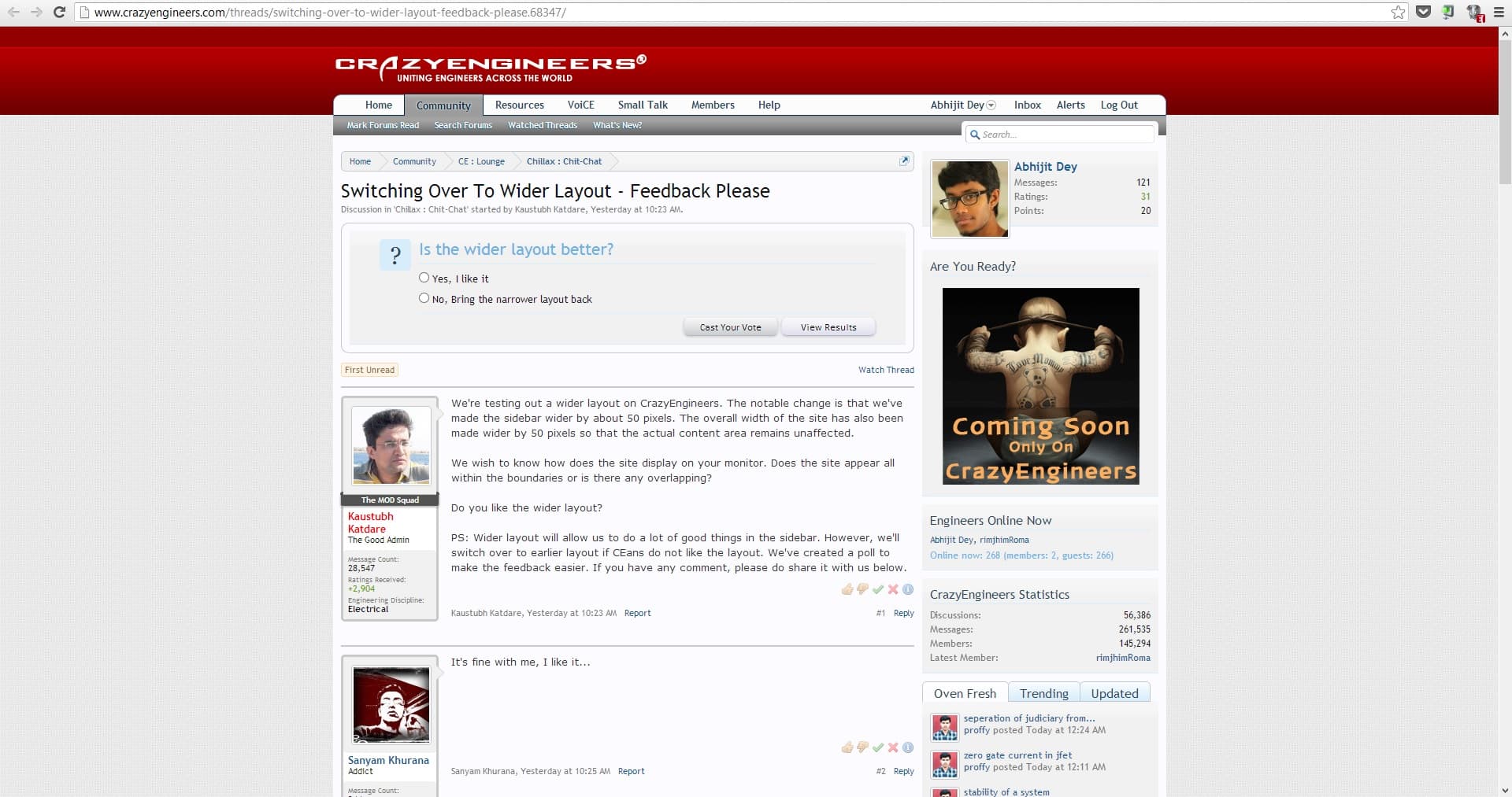
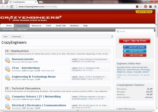
We're testing out a wider layout on CrazyEngineers. The notable change is that we've made the sidebar wider by about 50 pixels. The overall width of the site has also been made wider by 50 pixels so that the actual content area remains unaffected.

We wish to know how does the site display on your monitor. Does the site appear all within the boundaries or is there any overlapping?

Do you like the wider layout?

PS: Wider layout will allow us to do a lot of good things in the sidebar. However, we'll switch over to earlier layout if CEans do not like the layout. We've created a poll to make the feedback easier. If you have any comment, please do share it with us below.

Replies

  • Sanyam Khurana
    Sanyam Khurana
    It's fine with me, I like it...
  • Kaustubh Katdare
    Kaustubh Katdare
    I'd be better if CEans could tell us what's the screen size of their machines? We currently only have knowledge of overall resolution CEans are using to access CrazyEngineers.
  • Abhishek Rawal
    Abhishek Rawal
    Kaustubh Katdare
    I'd be better if CEans could tell us what's the screen size of their machines? We currently only have knowledge of overall resolution CEans are using to access CrazyEngineers.
    Screen Resolution : 1366 x 768
  • Kaustubh Katdare
    Kaustubh Katdare
    Abhishek Rawal
    Screen Resolution : 1366 x 768
    Do the side-boarders touch the browser in full width mode?
  • Abhishek Rawal
    Abhishek Rawal
    Kaustubh Katdare
    Do the side-boarders touch the browser in full width mode?
    Nope.
    Both ends have some empty space. You can utilise 'em.

    As I am using Ubuntu, some space is consumed by Unity launcher, so add some more for non-ubuntu users.
  • Kaustubh Katdare
    Kaustubh Katdare
    The point is not on utilising the space. Just that the increased width shoudn't have mess up with the boundaries. I'm quite sure the layout will work fine for most of the users.
  • Abhishek Rawal
    Abhishek Rawal
    I assume, the users with max. 1024 x 768 resolution will have side borders touching the browser.
  • lal
    lal
    1600 X 900
    Empty space on both sides.
    Screen
  • Harshad Italiya
    Harshad Italiya
    It looks good and love this wider layout.
  • graphite
    graphite
    Empty space on both sides in my machine too.
    Screen Resolution : 1366 x 768
  • Jeffrey Arulraj
    Jeffrey Arulraj
    Only it is creating a problem in 1024* 764 aspect so no issues hope the upgrade is not a single one

    Awaiting a package here
  • Abhishek Rawal
    Abhishek Rawal
    Conqueror
    hope the upgrade is not a single one
    Awaiting a package here
    The new features gonna change entire face of CE, trust that ๐Ÿ˜
  • Abhijit Dey
    Abhijit Dey
    I have a Full HD screen 1920x1080

    ce

    Looks great. Was hoping for the recent activity in threads to show more than 5 recent posts. That way we won't miss out on much if there was a flood of new threads.
  • Ankita Katdare
    Ankita Katdare
    I love wide. I always use one zoom mode on CE community. You guys should try it too. The font looks doubly clean and clear and makes you type more. ๐Ÿ˜

    #-Link-Snipped-# Can't really wait for the changes to come. This upgrade should be the awesomest in CE History.
  • Anil Jain
    Anil Jain
    Wider look, looks good.
    #-Link-Snipped-#, #-Link-Snipped-# -- Any clue ?? ๐Ÿ˜

    -CB
  • Kaustubh Katdare
    Kaustubh Katdare
    ...okay, I hope people aren't confusing between the following two things -

    • Next Upgrade (improvements, modifications to existing features, new smilies etc.)
    • Next 'Cool' Thing which is being teased through sidebar.
    They are TWO ENTIRELY DIFFERENT THINGS. ๐Ÿ˜ And each has its own discussion thread.
  • Kaustubh Katdare
    Kaustubh Katdare
    Someone's voted that the older layout looked good. Could you tell us what specific problems you're facing? It'll help us fix things asap.
  • Jeffrey Arulraj
    Jeffrey Arulraj
    I first saw the older layout in a 1024 * 764 screen that is my bad I found half the side bar sticking out and additional scrolling was needed

    PS: Is there a way of recasting votes ๐Ÿ˜ณ๐Ÿ˜ณ
  • lal
    lal
    Conqueror
    I first saw the older layout in a 1024 * 764 screen that is my bad I found half the side bar sticking out and additional scrolling was needed

    PS: Is there a way of recasting votes ๐Ÿ˜ณ๐Ÿ˜ณ
    There may be an option 'fit to width' in the page zoom settings. Might help to get a better viewing experience.
  • Kaustubh Katdare
    Kaustubh Katdare
    lal
    There may be an option 'fit to width' in the page zoom settings. Might help to get a better viewing experience.
    Not really, it'll break several things that will be launched on CE in coming days.
  • Ramani Aswath
    Ramani Aswath
    Kaustubh Katdare
    I'd be better if CEans could tell us what's the screen size of their machines? We currently only have knowledge of overall resolution CEans are using to access CrazyEngineers.
    1280 x 960 HP 18" diagonal monitor.
    The CE screen occupies only 80% of the width. Easy to read. Looks nice. It will be good if it can be retained.
  • Kaustubh Katdare
    Kaustubh Katdare
    Yes. We are retaining it. ๐Ÿ˜€
  • Saandeep Sreerambatla
    Saandeep Sreerambatla
    I use 1024 * 768 resolution!

    CE page looks good , only problem is I have to move the bar at the bottom to check the whole page which is quite irritating.
  • Kaustubh Katdare
    Kaustubh Katdare
    Majority of the audience have voted in favor of the wider layout. Now, the issue is that a large number of CEans would just see the site fine; but ~20-22k visitors every month would see a scrollbar at the bottom and may miss our teasers/content in the sidebar.

    The only solution is to switch to a narrower layout as before.

    #-Link-Snipped-# : How did the site look before we switched over to the wider layout? Were there unnecessary scrollbars?
  • Saandeep Sreerambatla
    Saandeep Sreerambatla
    The bottom scroll bar is a bit irritating at times. Since to reply to a post or a read any post it looks good. But If I have to check the top of the page i have to check the attached image.
  • Kaustubh Katdare
    Kaustubh Katdare
    In the interest of about 21-25k of our visitors who are still using 1024x768 resolution, we're narrowing our sidebar. There's really a tradeoff between the sidebar width and the content width.

    With the new width of the sidebar, I think on 1024x768 display; the borders of the site 'just touch' the screen.

    Can someone quickly confirm if there are no scrollbars or overlaping with this new update?

    Tagging #-Link-Snipped-#.
  • Satya Swaroop Dash
    Satya Swaroop Dash
    I use a 1024x768 display and there are no scrollbars or overlapping.
  • Kaustubh Katdare
    Kaustubh Katdare
    Satya Swaroop Dash
    I use a 1024x768 display and there are no scrollbars or overlapping.
    Good to hear that. You're talking about the bottom scrollbar, right? I think the boundaries of the site however touch the browser's edge, leaving no space in between. Is that right?

    Also, with the wider sidebar; were you getting a scrollbar at the bottom?
  • Satya Swaroop Dash
    Satya Swaroop Dash
    In Opera, there is no scrollbar in the bottom.
    Opera
    But in Firefox and Chrome there is a scrollbar. Just some area appears out. I mean a few pixels as you can see from the screenshots below.
    Firefox Chrome
  • Kaustubh Katdare
    Kaustubh Katdare
    Are you on 100% zoom? Hit ctrl+0 (zero) to reset zoom level. Can't go narrower than this.
  • Satya Swaroop Dash
    Satya Swaroop Dash
    Checked with Ctrl + 0, the same results.
  • Kaustubh Katdare
    Kaustubh Katdare
    Satya Swaroop Dash
    Checked with Ctrl + 0, the same results.
    I think it's because of the scrollbar size. I hope it's not annoying though. We really can't go narrower than this.
  • lal
    lal
    It is because, Opera renders CSS the best ๐Ÿ˜ You never mess up in Opera ๐Ÿ˜›

    The auto fit option could be 'on' in Opera. Check.
  • Satya Swaroop Dash
    Satya Swaroop Dash
    lal
    It is because, Opera renders CSS the best ๐Ÿ˜ You never mess up in Opera ๐Ÿ˜›
    The auto fit option could be 'on' in Opera. Check.
    Yes #-Link-Snipped-# the fit to width option is on.
    and #-Link-Snipped-#, the minuscule scrollbar on the bottom is not that annoying, its the page is displayed just well and scrolling is not needed at all to view the contents.
  • Saandeep Sreerambatla
    Saandeep Sreerambatla
    I dont see a bottom scroll bar at all ๐Ÿ˜€ Looks great now!!
  • Kaustubh Katdare
    Kaustubh Katdare
    English-Scared
    I dont see a bottom scroll bar at all ๐Ÿ˜€ Looks great now!!
    Which browser+OS are you using and what's the resolution? Also check if you are viewing at 100% zoom.
  • Saandeep Sreerambatla
    Saandeep Sreerambatla
    My zoom is 100%. OS is Windows XP and browser is chrome 22.0.1229.95 m.
  • Jeffrey Arulraj
    Jeffrey Arulraj
    XP + FF there is scroll bar but it is insignificant so no issues here as well

You are reading an archived discussion.

Related Posts

Mobile TeleSystems or MTS, the wireless voice, broadband Internet, messaging and data services company headquartered in Delhi, India is here with a new product of its own. The MTS Duet...
After working on it for a really long time - we're ready for the big launch! Take our word - you certainly don't want to miss out on this one....
Leaked images of cheaper iPhone are doing rounds on the Internet. The cheaper iPhone is expected to be made available with downgraded specs and of course at a lower price....
hi, My project involves writing of certain data on to the EEPROM of PIC I want to know, is there any application for PC that can be used to get...
The Xperia Z Has earned quite a lot of accolades for its new OmniBalance design, so taking this design to the mid/lower end market Sony has launched the Xperia M....