
Windows Vs. OSX Font Rendering Differences
@thebigk
•
Oct 15, 2024
Oct 15, 2024
1.5K
I created a power point presentation on Mac OSX, added it to my Dropbox and then downloaded it on my Windows 7 machine to edit it further. To my horror, what looked totally beautiful on my Mac looked terrible on Windows. I figured out that both these operating systems render the fonts differently. To my eyes, the font rendering of OSX is smoother and that of Windows is sharper. I personally like the OSX's way of doing it, but Windows is more readable from a distance.
I searched for information and found this discussion: #-Link-Snipped-# . Following is the screenshot from the same source -
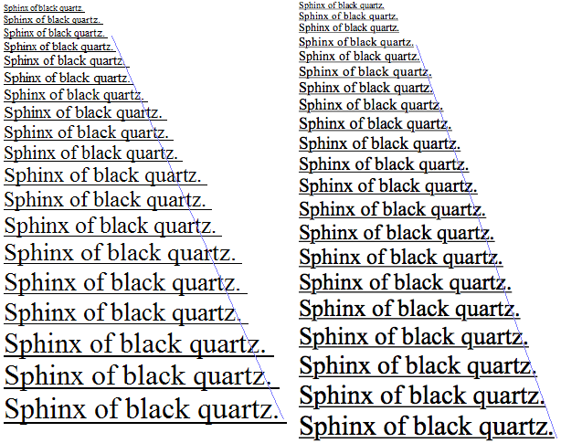
I searched for information and found this discussion: #-Link-Snipped-# . Following is the screenshot from the same source -
On the left, you have Windows and on the right is the OSX version of the font 'Times New Roman'. Look at blue line on the right to give an idea of the scaling of the fonts. In Windows (left), the font scaling isn't linear while in OSX, it's clearly linear and more natural.
I first thought that it's the quality of display that makes this different, but that isn't the case. What do you think?