Windows 8 Logo Is A Window, Not A Flag!
@thebigk
•
Oct 16, 2024
Oct 16, 2024
1.0K
The Redmond giant has just unveiled the new logo for the 'one platform for all' operating system, Windows 8. Microsoft's Sam Moreau in his #-Link-Snipped-# wrote that the new logo is in tune with Microsoft's promise to rethink the operating system. Microsoft's left nothing re-explored and that includes the company's Logo for Windows as well. Microsoft's logo has had a long history of contributing to the success of its operating system. However, the design team at Microsoft decided to redesign the logo to make it fit perfectly with the 'metro style' redesign of the user interface.
The design company that did the final job of designing Microsoft Windows 8 logo is "<a href="https://www.pentagram.com/work/#/all/all/newest/" target="_blank" rel="noopener noreferrer">Work — Browse by type of client</a>". The question designers at Pentagram asked is "Your name is Windows, then why does your logo look like a flag?". It seems that the new Microsoft Windows 8 logo now takes a look of a Window and not the traditional flag.
Now take a look at the following new official Windows 8 logo and share your opinion about it.
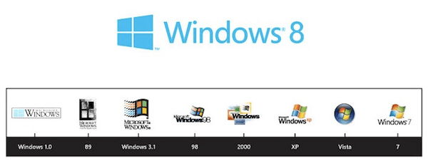
Also take a look at the history of all the MS Windows logos and pick your favorite one. My personal favorite is Windows XP logo 😀 What about you?
The design company that did the final job of designing Microsoft Windows 8 logo is "<a href="https://www.pentagram.com/work/#/all/all/newest/" target="_blank" rel="noopener noreferrer">Work — Browse by type of client</a>". The question designers at Pentagram asked is "Your name is Windows, then why does your logo look like a flag?". It seems that the new Microsoft Windows 8 logo now takes a look of a Window and not the traditional flag.
Now take a look at the following new official Windows 8 logo and share your opinion about it.
Also take a look at the history of all the MS Windows logos and pick your favorite one. My personal favorite is Windows XP logo 😀 What about you?