CrazyEngineers
  • How to make breadcrumbs responsive using CSS?

    Ankita Katdare

    Ankita Katdare

    @abrakadabra
    Updated: Oct 19, 2024
    Views: 1.8K
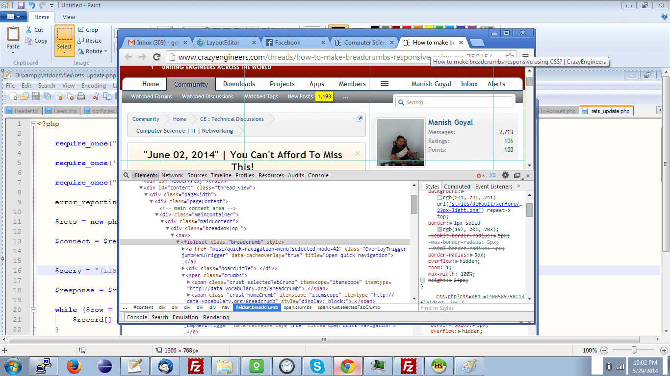
    As you can see on CrazyEngineers, the breadcrumbs (or Navigation tabs) follow the responsive design. It means they adjust to the size of the screen. I want to know how it is implemented using CSS.

    Here are two screenshots to explain what I am trying to say (if it's not clear from the text) -

    In full width -

    Screen Shot 2014-05-29 at 8.56.17 PM

    On a small screen -

    Screen Shot 2014-05-29 at 8.56.10 PM

    I think the trick here is to use the CSS property -

    text-overflow: ellipsis
    But there's more to it, because this alone doesn't work.

    Could someone tell me what is at work here?
    0
    Replies
Howdy guest!
Dear guest, you must be logged-in to participate on CrazyEngineers. We would love to have you as a member of our community. Consider creating an account or login.
Replies
  • Manish Goyal

    MemberMay 29, 2014

    no it is .breadcrumb class

    max-width:100% through which even screen size is reduced the the width of breadcrumb section will always remain consistent

    height:24px; is the one that contributes to look of breadcrumb section, see attached screenshot, how it will look when this will be removed


    screenshot
    Are you sure? This action cannot be undone.
    Cancel
  • Ankita Katdare

    AdministratorMay 29, 2014

    Hey! Thanks a lot. That does work. 😀

    So, it seems that the text-overflow property is used for adding the trailing dots only. 😛 In technical terms - "Render an ellipsis ("...") to represent clipped text"

    I hope this information helps others with similar issues.
    Are you sure? This action cannot be undone.
    Cancel
  • Manish Goyal

    MemberMay 29, 2014

    yes correct
    Are you sure? This action cannot be undone.
    Cancel
Home Channels Search Login Register