CrazyEngineers
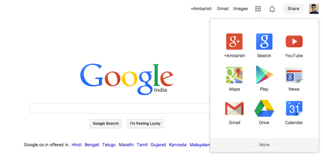
  • Search-giant Google has initiated rolling out its newly revamped homepage and logo, following the furbishing of Yahoo logo and Microsoft Bing search utility. The new logo is flattened and reshaped slight, while the menu bar has paved way for lesser span of links on the topmost right side. To reveal other products - such as Google Drive storage, YouTube videos or the Android app Play Store - visitors to the firm's search page must now click on the App grid (the icon made up of small squares). A Google spokesperson hinted at similar changes gradually effecting across its products.

    Screen Shot 2013-09-21 at 9.42.49 AM

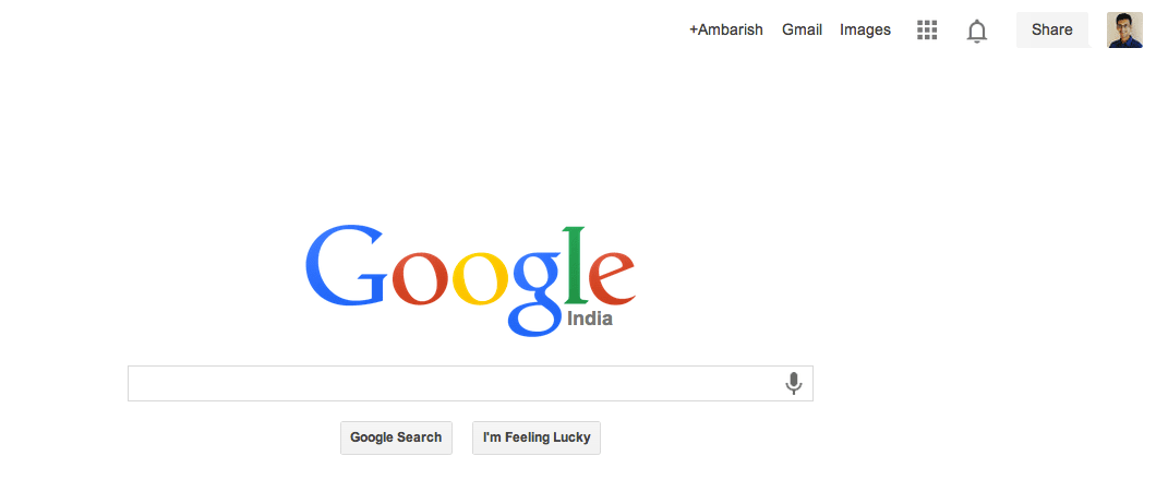
    The #-Link-Snipped-#blog added that Google intends to streamline users' experience of its services so as to avoid unnecessary distractions. This is the first change in Google logo since 2010, and not all online users shall be seeing the redesign LIVE as of yet. To reveal other products - such as Google Drive storage, YouTube videos or the Android app Play Store - visitors to the firm's search page must now click on an icon made up of small squares. "I do think that there is a move to try to make Google+ more central to everything its users do," said Carolina Milanesi from the tech advisors Gartner. "It might be the case that it is not obvious to some people that they need to click on the box to reveal the firm's other services."

    Screen Shot 2013-09-21 at 9.43.39 AM
    Cutting down the number of links may boost social network Google Plus' activity, suggests an analyst. Sarah Rotman Epps, an analyst at the tech consultancy Forrester, stated that this is a season for tech updates, and no matter what the service, all just want to appear fresh before Christmas fest. And as most of these software companies depend on user loyalty, the changes made are quite subtle so as to not alienate their existing customers.
    Replies
Howdy guest!
Dear guest, you must be logged-in to participate on CrazyEngineers. We would love to have you as a member of our community. Consider creating an account or login.
Replies
  • Ankita Katdare

    AdministratorSep 19, 2013

    And we thought that the Google homepage couldn't be more simpler! 😁
    The revamp features a flattened, reshaped logo and replaces the previous menu bar with a smaller range of links on the page's right-hand side. So much for the looks! Whoa.
    And I think one of the disadvantages of this launcher is that a lot of users might not realise it's even there as the app grid is hidden till the user clicks on the launcher button.
    Are you sure? This action cannot be undone.
    Cancel
  • Anoop Kumar

    MemberSep 19, 2013

    now we need to click more to go specific service. they did just like it for youtube.
    earlier to change resolution there only 2 clicks required now we need 3 clicks. that not good.
    Better they will expand this menu on hover only.
    Are you sure? This action cannot be undone.
    Cancel
  • Ambarish Ganesh

    MemberSep 20, 2013

    I personally like this new renovated look. While Yahoo logo change amounts to zilch, the new Google homepage clears a huge clutter. Also, 'The Verge forum'-like App Launcher looks cool! 😀
    Are you sure? This action cannot be undone.
    Cancel
  • Sarathkumar Chandrasekaran

    MemberSep 20, 2013

    Yes i agree to ankita and inoop.mostly users want a simpler and easy navigational menu to search their favorites but making it a two stage or three stage will hinder the ease of usage.We want every app to be visible like the old one.
    Are you sure? This action cannot be undone.
    Cancel
  • Ambarish Ganesh

    MemberSep 20, 2013

    Updated the post with new images from your sincerely's revamped Google profile! 😀
    Are you sure? This action cannot be undone.
    Cancel
  • Ankita Katdare

    AdministratorSep 22, 2013

    Is anyone here in India able to see the revamped page? I am still seeing the old and bold version.
    Are you sure? This action cannot be undone.
    Cancel
  • Kaustubh Katdare

    AdministratorSep 22, 2013

    Ankita Katdare
    Is anyone here in India able to see the revamped page? I am still seeing the old and bold version.
    Google's said it will take 'a few weeks' time for the global roll-out. I wonder why do they take so much time to roll out a new logo? Just replace the image file with the new logo and you're on!

    But the other 'technical' rollouts may obviously take time. They first release it in the United States, see how it works and then roll it out in India and other countries.
    Are you sure? This action cannot be undone.
    Cancel
  • Saandeep Sreerambatla

    MemberSep 22, 2013

    I am able to see the new logo page in India!!
    Are you sure? This action cannot be undone.
    Cancel
  • Ambarish Ganesh

    MemberSep 22, 2013

    Ankita Katdare
    Is anyone here in India able to see the revamped page? I am still seeing the old and bold version.
    Check the post images! 😀 Many Indians now have the new version. Others shall get it soon enough it seems.
    Are you sure? This action cannot be undone.
    Cancel
  • Jeffrey Arulraj

    MemberSep 23, 2013

    The looks are better and the ease of use is much better than that of the older one

    And I am eagerly waiting for the global roll out

    Is there any specific deadline before it will be up for the whole world?
    Are you sure? This action cannot be undone.
    Cancel
Home Channels Search Login Register