
Gmail New Sign-In Page Preview

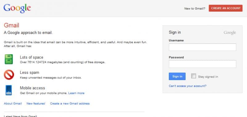
Google has launched a new sign-in page for Gmail. Lot of users are noticing a small text link at the bottom of regular gmail sign-in page which takes the user to the new page. Here's how it looks -
Gmail-Sign-In-Page

The new gmail sign-in page looks a lot cleaner, much like the new inbox theme Google introduced. The new sign-in page shades the default blue-white combination for the new light grey - white combination. The sign-up button, used to created new Gmail account has been moved to the top right corner. The new sign in page looks cool and clean and I absolutely love the new look and feel.

Have our other readers obtained access to the new preview page?

Replies

Welcome, guest

Join CrazyEngineers to reply, ask questions, and participate in conversations.

CrazyEngineers powered by Jatra Community Platform

  • ShrinkDWorld

    @shrinkdworld-WWdBBc Aug 11, 2011

    Why google do such things? what is a logic in this case??😐

  • Kaustubh Katdare

    @thebigk Aug 11, 2011

    I think it's all about offering a unified, regular 'Google Experience' across all of Google.

  • Rau
    Rau

    @rau-tIEsGP Aug 11, 2011

    The_Big_KI think it's all about offering a unified, regular 'Google Experience' across all of Google.

    Does it offer any technical advantage or is it just *IT LOOKS BEAUTIFUL* thing?

  • Kaustubh Katdare

    @thebigk Aug 11, 2011

    RauDoes it offer any technical advantage or is it just *IT LOOKS BEAUTIFUL* thing?

    I don't think there are any technical enhancements in that page. It could be just few CSS related updates that gives the sign-in page a uniform look like the Gmail simplified inbox.

  • Rau
    Rau

    @rau-tIEsGP Aug 21, 2011

    I have tried the theme and, it appears that you are correct. Everything is similar except the signup page. Probably, there is a commercial plan which google is trying to apply just to attract customers.

    *Looks Beautiful* cannot be the lone aspect for Google.