CrazyEngineers T-Shirt Draft

Here's a draft of the official CrazyEngineers T-Shirt. The art has been created by #-Link-Snipped-# and rearranged by yours truly.

Note that it's still a draft and everything's still on the computers. Your comments will help us understand what our CEans would prefer.

Engineering-T-Shirt-Draft

This is how it'd look like on the round-neck t-shirt. Considering that majority of us have chosen the Polo t-shirt, we might put it up on the back side of the-shirt.
Replies

Welcome, guest

Join CrazyEngineers to reply, ask questions, and participate in conversations.

CrazyEngineers powered by Jatra Community Platform

  • Anoop Mathew

    @anoop-FRTf1L • Jun 21, 2014

    Kaustubh KatdareThis is how it'd look like on the round-neck t-shirt. Considering that majority of us have chosen the Polo t-shirt, we might put it up on the back side of the-shirt.

    Welcome move. However it'd be more sexy if each color has a different arrangement. You don't want to have 2 different shirts with similar designs. Either keep a design unique for a color, i.e. there'll be 3 different colored t-shirts with three different colors; or let users select the design required for the color of their choice with three designs in place. Well done #-Link-Snipped-# !

  • Kaustubh Katdare

    @thebigk • Jun 21, 2014

    If the design is in white; we can have multiple dark colored t-shirts. Our struggle is to keep the price & quality balance; with more preference to the quality than the price.

    I was wondering if the design looks crowded. Should we space them up or eliminate a elements? Or is okay the way it is now?

  • Anoop Mathew

    @anoop-FRTf1L • Jun 21, 2014

    Kaustubh KatdareIf the design is in white; we can have multiple dark colored t-shirts. Our struggle is to keep the price & quality balance; with more preference to the quality than the price.

    I was wondering if the design looks crowded. Should we space them up or eliminate a elements? Or is okay the way it is now?

    You are looking it from the front view. Take the design to the back of a polo shirt and it'd look fine. Keep this ratio, enlarging this would mean that you'd have to remove some elements from the picture. This is a good size I believe. And if you could share the pics designed by #-Link-Snipped-#, we could give it a design try.

  • Satya Swaroop Dash

    @satya-swaroop-YDeBJM • Jun 21, 2014

    First of all, kudos to #-Link-Snipped-# who has managed to cram all these engineering elements in the best possible manner as possible. Second, the element has been incorporated on the T Shirt quite well because a portrait orientation would have occupied more area on the T Shirt and that would have looked cluttered.
    Along with the while on black combo we could also go for a black on white combo.

  • [Prototype]

    @prototype-G9Gn5k • Jun 21, 2014

    The design looks amazing. I suggest in front you put the slogan as "Proud to be a Crazy Engineer" while on back of it, just put the CE logo(covering half of the tee?) with the CE slogan.

    Also it would be interesting to see T-Shirts customized to particular field of engineering in addition to this generic one. I mean, this will give some variety.

  • Sarathkumar Chandrasekaran

    @sarathkumar-FEGRPw • Jun 21, 2014

    Great work #-Link-Snipped-#
    More drafts would help us to comment on detail s

  • Sanyam Khurana

    @sanyam-Nl7Zqc • Jun 21, 2014

    Honestly, I feel a lot of things occupy the logo, I mean there's just a small space where actual printing is done, so it's look over crowded to me. May be just scattering them/ removing them would help.

    However, I was thinking why not give people option to choose different design, color, quality, size etc. in short, customize a tee for themselves. It would be really great. ๐Ÿ˜€

  • Ankit Litoriya

    @ankit-litoriya-E1enaJ • Jun 21, 2014

    I feel like there should be a technical quote at behind related to the familiar discipline ( Branch, stream or related technical field like Electronics and computer science) looks pretty cool ..totally technical

  • lal
    lal

    @lal-R60Xjx • Jun 21, 2014

    Woh! I don't wanna see any changes from what is now there. What I see there perfectly reflects Crazyness and Engineering! ๐Ÿ˜

    Great work etrnalthinker!

  • Kaustubh Katdare

    @thebigk • Jun 21, 2014

    We are going to onspect the quality of t shirts tomorrow. Will also have to find out whether there are any considerations from the printing folks.

    Note that multiple color option may not be possible right now. If we want discipline specific designs, we will need at least 100 preorders of each design. Will confirm the details tomorrow.

  • Kaustubh Katdare

    @thebigk • Jun 21, 2014

    Addendum: will try to post a more spread out design. I am disliking the rectangular patch like layout.

  • Anoop Mathew

    @anoop-FRTf1L • Jun 21, 2014

    Kaustubh KatdareAddendum: will try to post a more spread out design. I am disliking the rectangular patch like layout.

    How about a circle?

  • Kaustubh Katdare

    @thebigk • Jun 21, 2014

    Anoop MathewHow about a circle?

    Let me see. We should be able to put it up on the back of the polo t-shirt. As the Winter season approaches, I'd like to go for the Hoodie option as well. It's my personal favourite. We'll have it as a 'limited edition'.

    As far as the design is concerned, we want to keep it a single colour; because that brings down the cost. However, if there's a demand for multicoloured art-work; we can make it too. We'll need pre-orders though.

  • Anand Vardhan

    @anand-vardhan-6ckgdB • Jun 22, 2014

    Excuse me for the interrupting ๐Ÿ˜€p). I think this rectangular thing has quite a lot of things stuffed in. So, (according to me ๐Ÿ˜’) there should only be a small band of the logo on right hand sleeve and also on left side of chest. And this thing should be present on the back side! โ˜• ๐Ÿ˜‰

    **Correction** interruption ๐Ÿ˜›๐Ÿ˜›

  • Pensu

    @pensu-8tNeGU • Jun 22, 2014

    Frankly, it looks too messy. I guess a minimalistic design with a good quote, something like "Proud to be an engineer/CEan", would have more appeal.

  • Kaustubh Katdare

    @thebigk • Jun 22, 2014

    Let me try and post a different version of it. I'll also try to come up with a minimalistic version which we can use.

  • Harshad Italiya

    @harshad-ukH5ww • Jun 22, 2014

    Whenever #-Link-Snipped-# makes a design there is very little chance you have any suggestion.

    Superb design buddy as ALWAYS ! ๐Ÿ‘

  • Kaustubh Katdare

    @thebigk • Jun 22, 2014

    Here's the draft #2.

    • Separated the elements to make the design more spacious
    • Got rid of the 'rectangular patch' and scattered the elements (few elements are now tilted). The pulley has been kept verticle for obvious reasons ๐Ÿ˜‰

    t-shirt-draft-2

  • Kaustubh Katdare

    @thebigk • Jun 22, 2014

    This is how it'd look like on the Polo T-Shirt {Click On the Thumbnails For Bigger Images}

    front-t-shirt t-shirt-back

  • Harshad Italiya

    @harshad-ukH5ww • Jun 22, 2014

    Kaustubh KatdareThis is how it'd look like on the Polo T-Shirt {Click On the Thumbnails For Bigger Images}

    front-t-shirt t-shirt-back

    Compare to this one I like first draft more. ๐Ÿ˜€

  • Kaustubh Katdare

    @thebigk • Jun 22, 2014

    Guy, keep the feedback flowing. We need it to make sure that we make the best t-shirt for you! ๐Ÿ˜€

  • Kaustubh Katdare

    @thebigk • Jun 23, 2014

    We've a very lukewarm response here. I think I'll trust my own design acumen ๐Ÿ˜ to get the tee done.

  • Anil Jain

    @CrazyBoy • Jun 23, 2014

    Kaustubh KatdareThis is how it'd look like on the Polo T-Shirt {Click On the Thumbnails For Bigger Images}

    front-t-shirt t-shirt-back

    Very cluttered...
    Sorry, did not like it ๐Ÿ˜”

  • Anil Jain

    @CrazyBoy • Jun 23, 2014

    What about just writing the Quote and the CE Logo?

  • Sanyam Khurana

    @sanyam-Nl7Zqc • Jun 23, 2014

    Why not something really appealing yet 'simple'.

    Something really Awesome ๐Ÿ˜‰

  • Ankita Katdare

    @abrakadabra • Jun 23, 2014

    I guess taking everyone's opinions isn't the right way to go sometimes.
    Will tag a few more CEans here anyway.

    We have to remember that the design looks different when in actual print on the tee.

    To give it a start - we shall go only for a generic design (one that covers all branches). Customized branch-specific ones can come later.

  • Ambarish Ganesh

    @ambarish-PQyoXg • Jun 23, 2014

    I'm in favor of minimalistic design too. ๐Ÿ˜€ This design as it is looks good, but just one element from every branch (for the generic design) should be more than enough.

    Presently "CrazyEngineers" on the design is not prominent enough.

    EDIT : It's one 'small' element from each branch.

  • Kaustubh Katdare

    @thebigk • Jun 23, 2014

    I think it makes sense for us to go with a generic engineer; because that's the essence of CrazyEngineers. We would look at launching discipline specific tees; but we will need bulk orders first.

  • Satya Swaroop Dash

    @satya-swaroop-YDeBJM • Jun 23, 2014

    The problem with the first design (the rectangular landscape arrangement) was that all the small elements managed to be lost in the chaos because of the small design. In the second one (Biggieรขย€ย™s changed version) all the elements were scattered randomly without order. If the scattering would have been done over a larger area it would have looked good.

    I am also liking #-Link-Snipped-# รขย€ย˜s idea of putting elements in a circle. In that way all the small design elements can fit in a larger area without looking odd.

  • Kaustubh Katdare

    @thebigk • Jun 23, 2014

    Okay, let me try the circular design today. If we're to keep just one element of each major engineering branch, suggest the elements that represent your discipline.

    • Electrical : Towers
    • Communications: Dish Antenna or Satellite
    • Electronics: Circuit
    • Chemical: Beaker / Flask or Test Tube
    • Mechanical: Hammer?
    • Aerospace: Airplane
    • Civil : Buildings or Bridges
    • Metallurgy : Atom (??)
    • Biomedical : Microscope (??)
  • Anoop Mathew

    @anoop-FRTf1L • Jun 23, 2014

    Kaustubh KatdareOkay, let me try the circular design today. If we're to keep just one element of each major engineering branch, suggest the elements that represent your discipline.
    • Electrical : Towers
    • Communications: Dish Antenna or Satellite
    • Electronics: Circuit
    • Chemical: Beaker / Flask or Test Tube
    • Mechanical: Hammer?
    • Aerospace: Airplane
    • Civil : Buildings or Bridges
    • Metallurgy : Atom (??)
    • Biomedical : Microscope (??)

    Since we need 'crazy' people to 'WANT' to buy this, let me give you an idea that came into my head. You can take time with designing because it 'Has' to create 'Demand'. We can not 'afford' to not 'intrigue' on this one. This discussion has been unfortunately going on too long now.

    Chaos! - try this mode.

    Just try one that looks like all these crazy symbols are coming out of a person's mind (an angular view of a small person with a big head on the right hand corner with a 'thinking' bubble; inside the bubble just arrange these symbols in a crazy manner i.e. make them look a bit off shape (pull a little horizontally and vertically). Outside this we can have a slogan with original CE logo (the writings can look off shape/cartoonish except the CE logo) such as:

    1. Addicted to CrazyEngineers.com
    2. Lost in thought at CrazyEngineers.com
    3. Intrigued by CrazyEngineers.com

    Request people with cartoon drawing skills to drop a bubble and a head and a pinch of cartoonish elegance to this idea.

  • Kaustubh Katdare

    @thebigk • Jun 23, 2014

    Sounds good; but we'll need design heads to do this ๐Ÿ˜ . My skills are pretty limited.

  • Anoop Mathew

    @anoop-FRTf1L • Jun 23, 2014

    Anoop MathewSince we need 'crazy' people to 'WANT' to buy this, let me give you an idea that came into my head. You can take time with designing because it 'Has' to create 'Demand'. We can not 'afford' to not 'intrigue' on this one. This discussion has been unfortunately going on too long now.

    Chaos! - try this mode.

    Just try one that looks like all these crazy symbols are coming out of a person's mind (an angular view of a small person with a big head on the right hand corner with a 'thinking' bubble; inside the bubble just arrange these symbols in a crazy manner i.e. make them look a bit off shape (pull a little horizontally and vertically). Outside this we can have a slogan with original CE logo (the writings can look off shape/cartoonish except the CE logo) such as:

    1. Addicted to CrazyEngineers.com
    2. Lost in thought at CrazyEngineers.com
    3. Intrigued by CrazyEngineers.com

    Request people with cartoon drawing skills to drop a bubble and a head and a pinch of cartoonish elegance to this idea.

    The bubble head can go circular and the person standing with head can look like a photograph taken with a Fisheye lens

  • Kaustubh Katdare

    @thebigk • Jun 23, 2014

    Many seem to be in favor of minimalistic design. We gotta strike a balance.

  • Sanyam Khurana

    @sanyam-Nl7Zqc • Jun 23, 2014

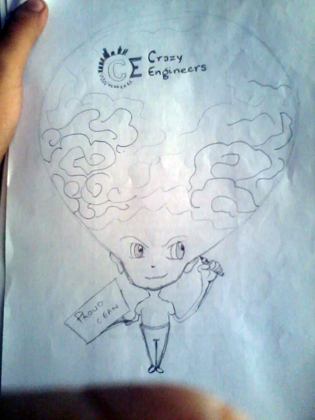
    So, I designed something (taking reference from Anoop Mathew's post)

    But it's a little bit different. + It's a rough sketch, the idea is to show a brain, it would be darker on the sides and lightly painted in the middle, then in the middle we would have CE logo and a bunch of other elements (Didn't draw any other elements)

    2014-06-24 12.36.46

  • Anoop Mathew

    @anoop-FRTf1L • Jun 23, 2014

    Kaustubh KatdareMany seem to be in favor of minimalistic design. We gotta strike a balance.

    Give it a try. We can see the interest rising with a competitive design.

  • Anoop Mathew

    @anoop-FRTf1L • Jun 23, 2014

    Sanyam KhuranaSo, I designed something (taking reference from Anoop Mathew's post)

    But it's a little bit different. + It's a rough sketch, the idea is to show a brain, it would be darker on the sides and lightly painted in the middle, then in the middle we would have CE logo and a bunch of other elements (Didn't draw any other elements)

    2014-06-24 12.36.46

    Post it!

    Edit: Can't view attachment from phone

  • Sanyam Khurana

    @sanyam-Nl7Zqc • Jun 23, 2014

    Anoop MathewPost it!

    Already posted.

  • Anoop Mathew

    @anoop-FRTf1L • Jun 23, 2014

    Sanyam KhuranaSo, I designed something (taking reference from Anoop Mathew's post)

    But it's a little bit different. + It's a rough sketch, the idea is to show a brain, it would be darker on the sides and lightly painted in the middle, then in the middle we would have CE logo and a bunch of other elements (Didn't draw any other elements)

    2014-06-24 12.36.46

    You did this within 10 minutes? Nice! Work on it. And try to include crazy symbols coming out of that brain. Also it will be printed white on black so try to accent it a little (darken some sides to make a sort of 3D effect)

  • Sanyam Khurana

    @sanyam-Nl7Zqc • Jun 23, 2014

    Anoop MathewYou did this within 10 minutes? Nice! Work on it. And try to include crazy symbols coming out of that brain. Also it will be printed white on black so try to accent it a little (darken some sides)

    ๐Ÿ˜› Yup ! Did it very fast, just a rough sketch to draw out the basic idea.

    Will try the details later ๐Ÿ˜€

    Busy in internship work ๐Ÿ˜€

  • Kaustubh Katdare

    @thebigk • Jun 24, 2014

    Update: We inspected the quality of the t-shirt material and I think we've a winner in terms of quality. The pricing seems good too and we'll be able to offer some concrete information about the price of t-shirts once we've finalised the design.

    The round-neck t-shirts offer more design choices and lower price too; but the demand seems to be more for the POLO t-shirts.

  • Keerthivasan Ravisankar

    @keerthivasan-hrKQir • Jun 24, 2014

    Why can't you arrange and make everything forms a layout of CE?
    so that it looks like CE when you look from distance. Keep every stuff that are found in current design.๐Ÿ˜จ๐Ÿ˜’

  • Kaustubh Katdare

    @thebigk • Jun 26, 2014

    Update: You guys will kill for the t-shirts we're in the process of creating! ๐Ÿ˜Ž Brace yourself for awesomeness!

  • Ankit Litoriya

    @ankit-litoriya-E1enaJ • Jun 26, 2014

    Ohhh!!!!!!!! really ,,,, if it is so, then i will sure like to go my office with these tees only .............๐Ÿ˜๐Ÿ˜

  • Anoop Mathew

    @anoop-FRTf1L • Jun 26, 2014

    Kaustubh KatdareUpdate: You guys will kill for the t-shirts we're in the process of creating! ๐Ÿ˜Ž Brace yourself for awesomeness!

    Please!!!!! ๐Ÿ˜๐Ÿ˜›

  • Kaustubh Katdare

    @thebigk • Jun 26, 2014

    ...and by the way - they aren't what you've seen so far! ๐Ÿ˜

  • Sanyam Khurana

    @sanyam-Nl7Zqc • Jun 27, 2014

    For our CEans like #-Link-Snipped-# , a t-shirt with quote

    "Bow Before Me, For I'm ROOT" would look cool, I guess. ๐Ÿ˜€

  • Kaustubh Katdare

    @thebigk • Jun 27, 2014

    We do want to make discipline specific t-shirts and boy we do have a great collection of quotes. But for the CE official t-shirt; we're going with a 'general engineering' t-shirt, that anyone can wear.

  • Abhishek Rawal

    @abhishek-fg9tRh • Jun 27, 2014

    ๐Ÿ˜
    I am trying to get this one, too damn costly if bought online -
    voidwarranties

  • Kaustubh Katdare

    @thebigk • Jun 27, 2014

    I personally wanted

    "Tested
    NOT OK"

    T-shirt ๐Ÿ˜