Announcing Responsive CrazyEngineers!
@thebigk
•
Oct 19, 2024
Oct 19, 2024
1.1K
CEans,
We're super excited to announce the launch of mobile optimised version of CrazyEngineers! The mobile optimised layout was one of the top requests made by CEans. The wait is over and we now have a mobile ready CE - so you can stay logged in all the time.
What's Responsive Design?
Responsive design is a 'smart' layout that adjusts itself according to the browser size. If you access CrazyEngineers from a mobile device, you will find that CE will automatically adjust itself - removing the sidebar and presenting well structured & easy-to navigate layout to the user. You can test this right now! How? Simply shrink the width of your browser and see how CE changes itself to focus on the content. Following screenshot will explain this clearly -
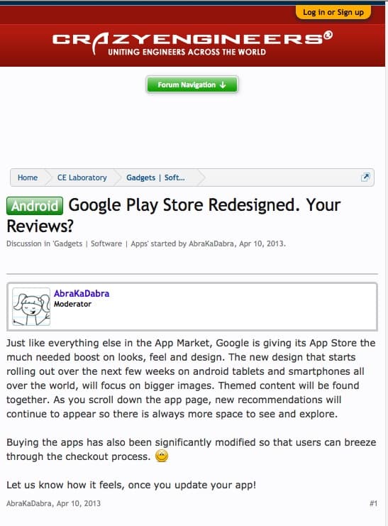
Take a note of the changes that take place as you browse the site through a mobile device. Here are a few of them-
You may now check your favorite discussions any-time via mobile and stay logged-in to CE all day long! 👍
Enjoy!
We're super excited to announce the launch of mobile optimised version of CrazyEngineers! The mobile optimised layout was one of the top requests made by CEans. The wait is over and we now have a mobile ready CE - so you can stay logged in all the time.
What's Responsive Design?
Responsive design is a 'smart' layout that adjusts itself according to the browser size. If you access CrazyEngineers from a mobile device, you will find that CE will automatically adjust itself - removing the sidebar and presenting well structured & easy-to navigate layout to the user. You can test this right now! How? Simply shrink the width of your browser and see how CE changes itself to focus on the content. Following screenshot will explain this clearly -
Take a note of the changes that take place as you browse the site through a mobile device. Here are a few of them-
- The sidebar is cut-off and is pushed down at the bottom.
- Navigation is clubbed inside a button and clicking/tapping on that button opens detailed menu.
- The user information is moved on the top of the message and other unnecessary information is cut-off.
- All the focus is goes to content - which is VERY important when you're accessing CE from a mobile or a tablet.
- Login / Logout options (drawer) is at the top and provides easy login.
You may now check your favorite discussions any-time via mobile and stay logged-in to CE all day long! 👍
Enjoy!