Unveiling The New CrazyEngineers
@thebigk
•
Oct 26, 2024
Oct 26, 2024
1.7K
Howdy CEans! We're super excited to roll out the all new CrazyEngineers (CE) to all of you. This roll-out is one of the biggest changes in the history of CE; because as you've noticed - we've adopted a new logo along with a brand new, flat design comprising mostly of red/black and white colors. We've put in a lot of efforts in the past few days to ensure that everything works fine; but as always - we'll rely on your feedback to help us discover and fix any broken pieces.

Our New Logo
Getting Used To The New CE
The new CrazyEngineers has several changes and features. Some of the most exciting ones are as follows-
Take your time to make yourself familiar with the new design and feel free to ask questions if you have any.
PS: We've organised a giveaway too! Keep an eye on the announcements section!
Our New Logo
Getting Used To The New CE
The new CrazyEngineers has several changes and features. Some of the most exciting ones are as follows-
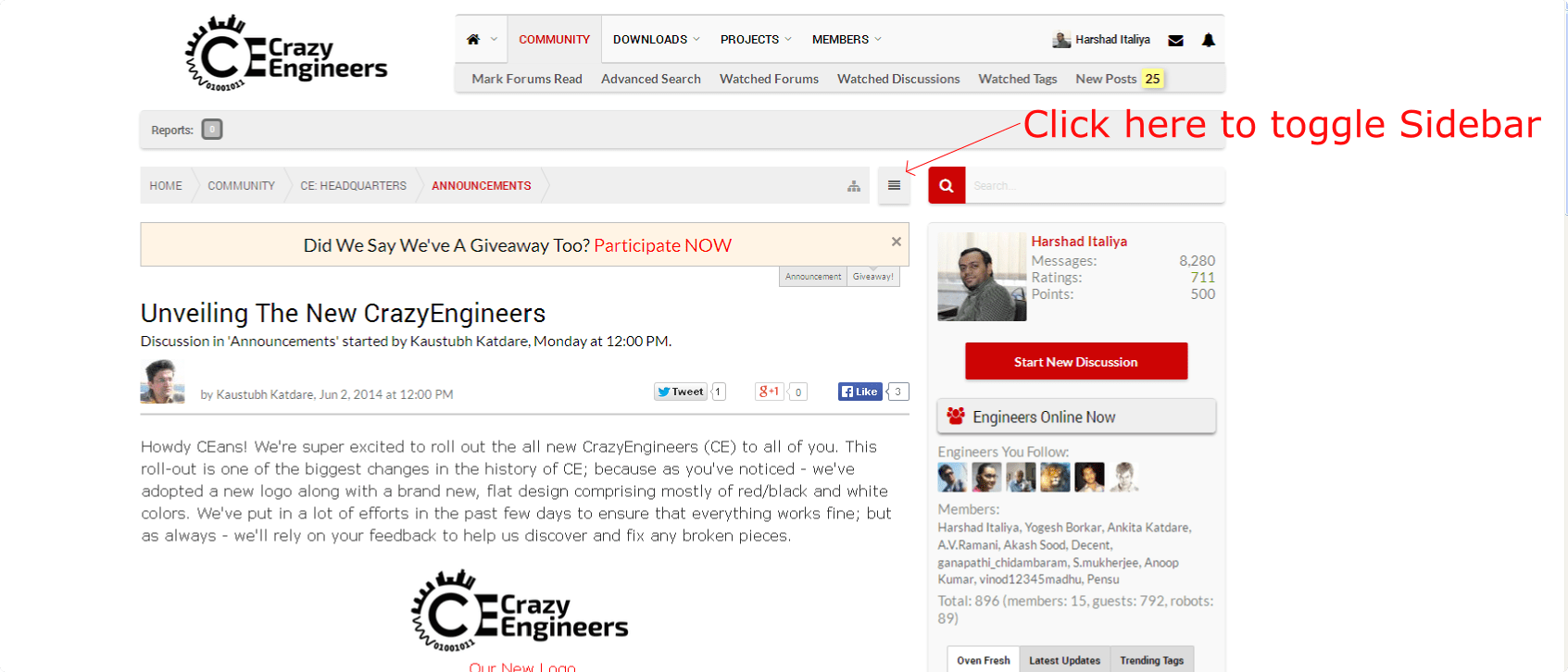
- The navigation bar has been shifted adjacent to the logo, saving space.
- The navigation bar is now sticky; so that you always have quick access to the menu and all your alerts.
- The sidebar is now collapsible. If you want bigger real estate, without any distractions; simply collapse it. Well, have you already discovered how to do that? If not, just ask below!
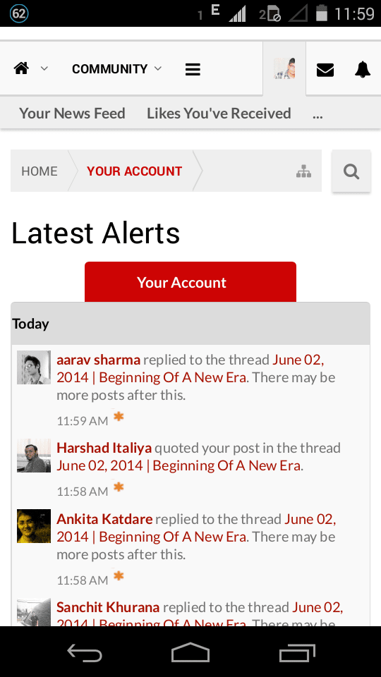
- Better Mobile Design: Reading experience on mobile phones and tablets is awesome!
Take your time to make yourself familiar with the new design and feel free to ask questions if you have any.
PS: We've organised a giveaway too! Keep an eye on the announcements section!
![[IMG]](proxy.php?image=http%3A%2F%2Fwww.crazyengineers.com%2Fstyles%2Fantiquark%2Fxenforo%2Fclear.png&hash=749021c8aecd50f221bd9eda15de9dbd)
![[IMG]](proxy.php?image=http%3A%2F%2Fs27.postimg.org%2F4zu0d6oqr%2Ffbrec.png&hash=87df1f46c54e34a7f1aee6da80273e68)